
Appearance
The Appearance tab controls how the FlowsPlay widget looks and reads. It applies when you use the FlowsPlay widget. If you run your own widget in API mode, this tab does not apply.
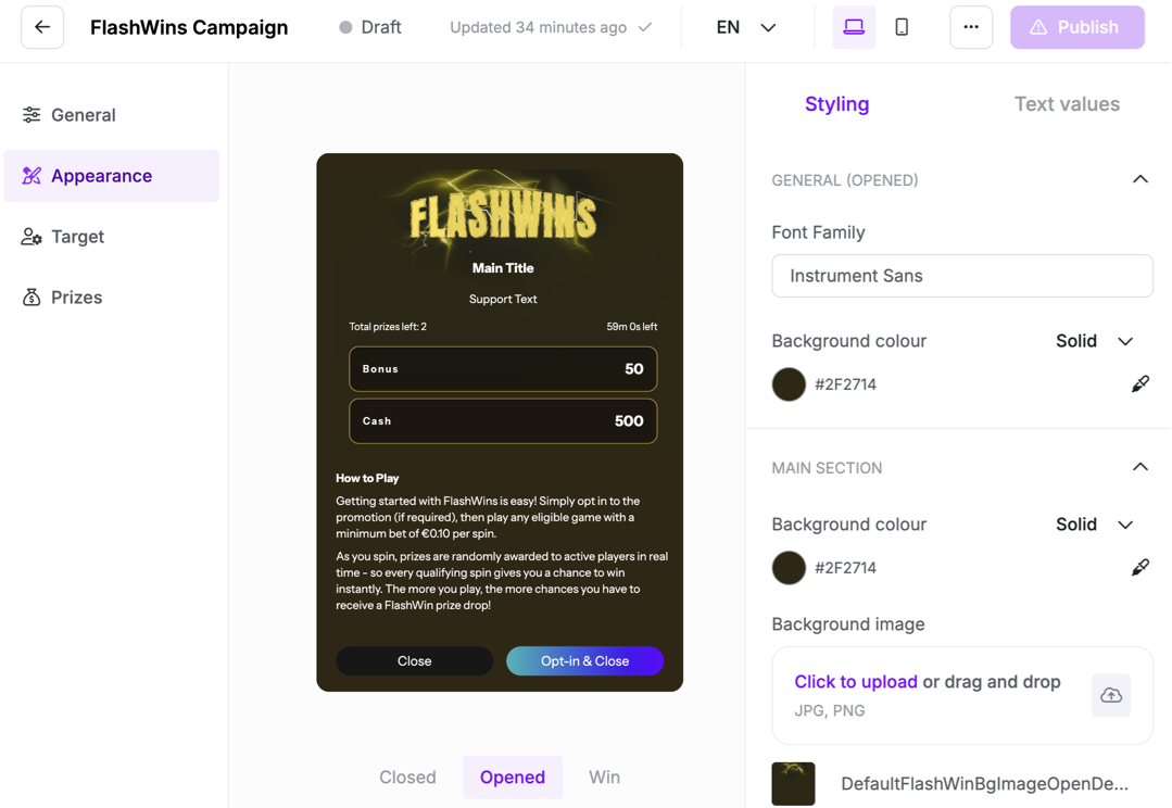
Sub-tabs and states
Appearance has two sub-tabs, Styling and Text values. A preview shows the widget in three states, and a desktop and mobile toggle previews each layout. A language selector lets you set styling and text per language.
State | What the player sees |
|---|---|
Closed | A small badge on the page that rotates between the prize count and the time remaining. |
Opened | The full panel with title, subtitle, time left, the prize cards, and a "How to play" section. |
Win | A celebration panel confirming the prize won and that it was credited automatically. |
Styling
Styling options are grouped by state.
Closed
- Widget variant (Floating or Toolbar) and position on the page.
- Rotating interval, in seconds, for the closed badge.
- Font family and game icon image.
- Background colour, solid or gradient.
Opened
- Background and main-section colours and images, and a logo.
- Title, subtitle, and time-left colours.
- Prize-card background, border, and text colours.
- Footer button colours, including the opt-in button when opt-in is on.
Win
- Background and an optional win animation.
- Header, message, and prize-area colours.
- Button colours.
Note: Desktop offers the full set of variants and positions. Mobile uses the toolbar layout.
Text values
Every label is editable, per state and per language. Each language starts from a default and can be overridden on its own.
State | Editable text |
|---|---|
Closed | Title, prizes-left label, time-left label. |
Opened | Main title, subtitle, time-left label, prizes-left label, opt-in-button text, opt-out-button text, close-button text, and a rich-text help editor for the "How to play" content. |
Win | Win message, prize text, additional info, and button text. |