Widget Customisation
The Appearance page is the first page on the Jackpot Configuration screen and allows you to customise the look and feel of the front-end widget together with all the text content. This will only be used if you've selected Widget mode (instead of API) on the first screen
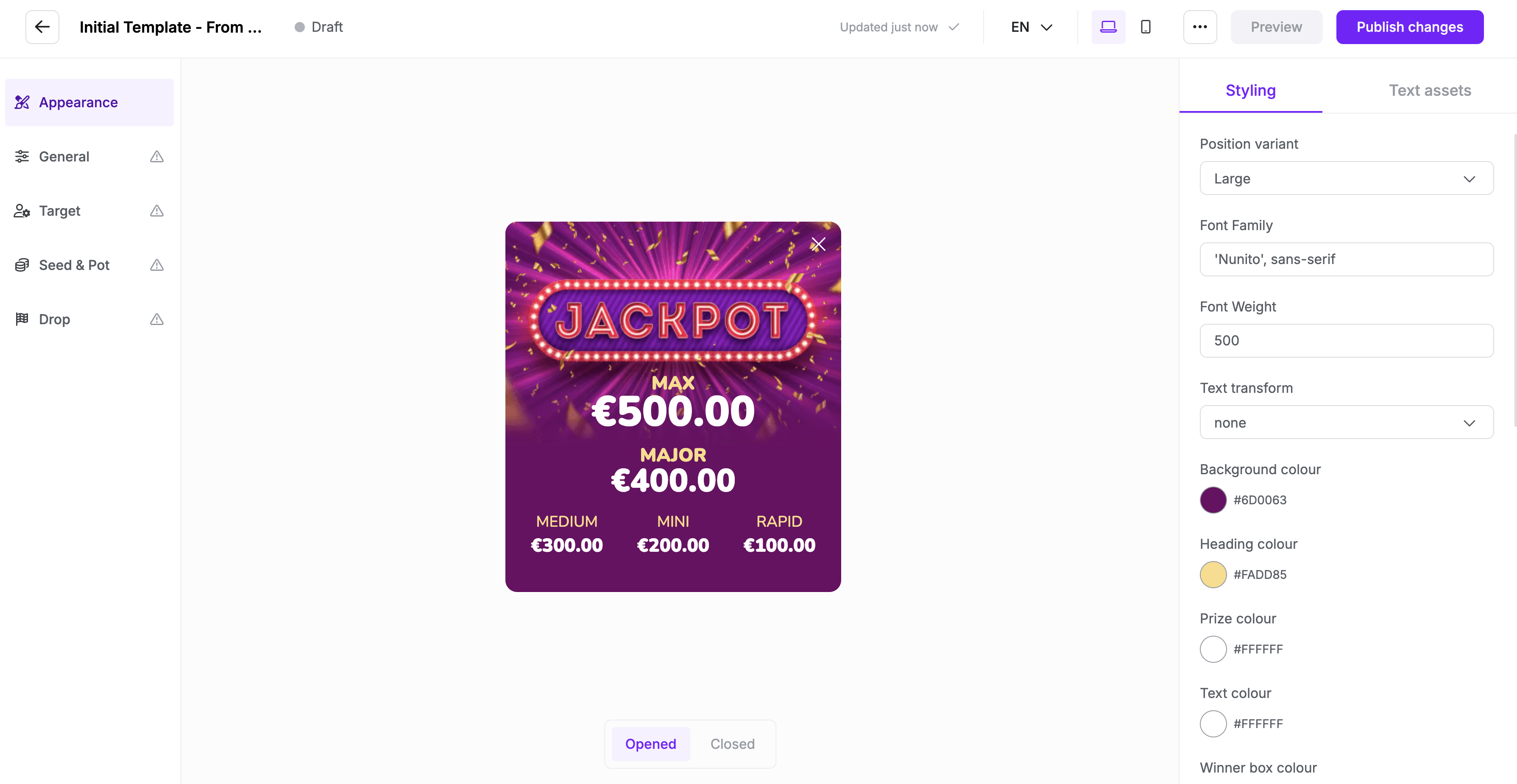
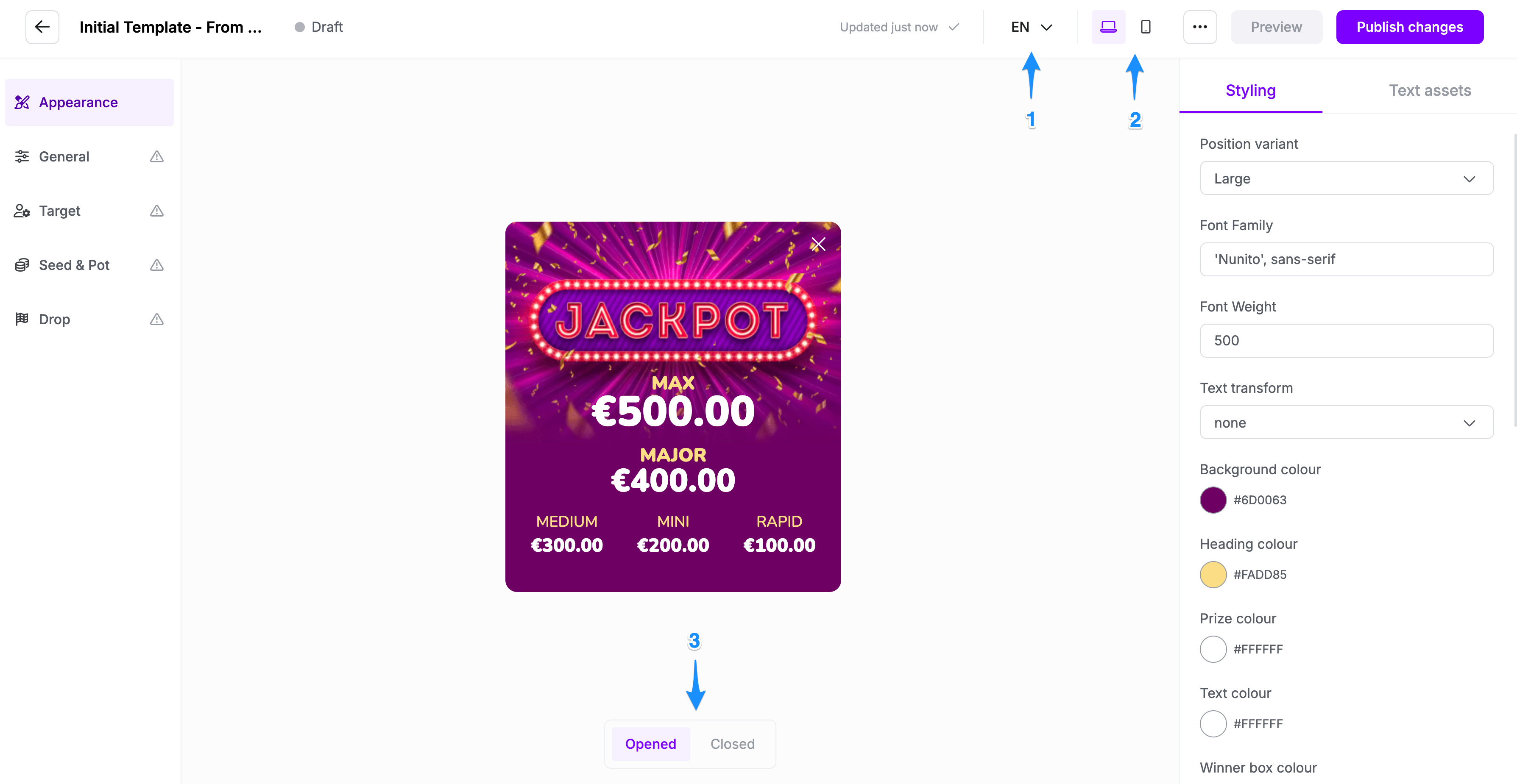
Styling Panel Fields
The Styling section allows users to modify the visual aspects of the jackpot widget.
1. Position Variant
- Options: Small, Medium, Large, StickyTop, StickyLeft
- Function: Adjusts the size and placement of the jackpot display within the interface.
2. Font Family
- Default Value
Nunito', sans-serif - Function: Defines the font style used in the jackpot display. Users can change this to other web-safe fonts.
3. Font Weight
- Default Value:
500 - Function: Determines the thickness of the text. Lower values (e.g., 300) make the text thinner, while higher values (e.g., 700) make it bolder.
4. Text Transform
- Options: None, uppercase, lowercase, capitalise
- Function: Controls how the text is displayed.
- None: Leaves text as written.
- Uppercase: Converts all text to uppercase.
- Lowercase: Converts all text to lowercase.
- Capitalise: Capitalises the first letter of each word.
5. Background Colour
- Example Value:
#6f0063(Purple) - Function: Changes the background colour of the jackpot display.
6. Heading Colour
- Example Value:
#FADD85(Gold/Yellow) - Function: Defines the colour of the heading text, such as the "JACKPOT" label.
7. Prize Colour
- Example Value:
#FFFFFF(White) - Function: Sets the colour of the displayed prize amounts.
8. Example Colour
- Default Value:
#FFFFFF(White) - Function: Defines the colour of other text elements, such as descriptions or additional details in the jackpot display.
Text Assets
The text assets tab allows you to set all text content of the widget and can be customised based on device as well as locale. By default the text assets under English/Desktop are used throughout but can be overwritten on other locales and devices.
Device, Locale, and State
You can customise the appearance and text assets of the widget for different devices and states. To add multiple languages, click the language selector (1), where you can add a new language. You can also switch between desktop and mobile variants by clicking the device selector (2). Each template can have multiple states—typically Opened and Closed—that represent different widget conditions (3).
Every variation starts with a default setting but can be fully customised to have a unique look and feel based on language, device, and state.